I would like to do a story about the Cougar Den opening at Beasley Coliseum which meant the first time beer has ever been sold at Beasley. It has been somewhat of a controversial decision by the university and I think it would make for an interesting story. Two people I could contact are Phil Weiler, the VP of marketing and communications for the university, and Chris Park, the Senior Associate Director of Athletics and External Relations.
Category Archives: Assignments
Reflection Post
I enjoyed the premiere project the most because I was already pretty comfortable with the program and I just enjoy shooting and editing videos. Being able to shoot the video with my friends was a fun process and I think the video turned out really well. Since I am a journalism and media production major, I learned a lot of valuable that I will be able to apply to almost every future class I am going to take. Especially with premiere and audition, a ton of jobs in the journalism field require experience in those programs or similar ones. COM 210 provided valuable experience in those programs that will undoubtedly serve me well in future classes. I learned a lot about photoshop and illustrator as well, which are programs I want to continue to learn and improve at in the future. There aren’t any skills that I wish I had learned in this course, but there are some skills that I wish I had more time to work on and refine. I struggled more with photoshop and illustrator more than the other programs, and I wish I had more time to work on my skills with those programs. I think more time would have helped my grade a lot on those projects. I wasn’t able to find any websites that were particularly helpful when it came to the projects we did. I occasionally google searched things when I couldn’t find a certain feature in a program, but there weren’t any websites that I found myself going back to for help. Overall, I think COM 210 was a very beneficial course and I learned a lot from it. I’m looking forward to applying the skills I learned through this course in the future, and I’m looking forward to taking classes like COM 310 and 320, which are extensions of this course.
Premiere Final Draft
For the final draft of my premiere project, I kept a lot of the material that I used in my draft. I thought that I had a lot of good shots in my draft and I liked the angles that I captured. I think I did a good job of not overusing transitions in my draft and I think my attempt at using key frames in one of the shots ended up turning out well. I decided to change a couple things about the title slides that I used at the beginning and end of my video. I changed the font color on the beginning title slide from white to gray because I thought having crimson and gray as my title slide would look better. I also changed the font on my ending title slide and I decreased the font size so it would fit better on the end slide. I did not realize that the text on the end slide didn’t fit the screen in my draft video, so I made sure to correct that for my final draft. I also changed some transitions that I used during the video. I made sure to add a transition to the short shot used of the ball rolling on the gym floor. I viewed it more as a transitional shot to begin with so I wanted to make sure it would be smooth coming out of that shot and going into the next one. I also added a dip to black on the end of my video to coincide with the audio fade that I put on the end of the music and voice over. This gives the entire video a feeling of closure and I think it made for a very smooth outro and a good ending to the project. Overall, I am happy with my final project and I think my video turned out quite well.
Premiere Draft
For my draft project, I decided to get a video of myself and some of my buddies from drum line playing basketball. Since playing sports together is the primary way we bond as a group, I thought it would lend itself to a good story. I couldn’t get a ton of people to come out and play the day we ended up shooting the video, but I think we were still able to capture the camaraderie between the people that showed up. I tried to shoot from as many angles as I could to diversify the shots that I got in the rec. I also shot some footage at a drum line rehearsal, as a way to connect those two worlds together and get a good establishing shot for my video. I had planned on starting on the topic of drum line during my voice over, so it made sense to get footage of a rehearsal. As for the editing process for the video, I went through a lot of different clips to try and find the strongest shots that I could, and I tried to differentiate as much as I could from shot to shot to make it visually appealing. I added some transitions and a couple title slides at the beginning and end, and I also tried using a key frame to zoom in on a bass drum head in one of the shots. I’m not sure if i like what i did with the key frame, but I thought I’d try it just to keep the viewer engaged. Unfortunately, the quality isn’t great, and I’m not sure why it changes so drastically once I email it to myself from my phone. I’ll see if I can find a solution to that problem before I submit my final draft.
Draft Audio Story
I decided to interview some of the members of the drum line that often go out and play sports together. Over the past year and a half, I saw that playing sports really helped to bring the group closer together. Myself and other members of the group have formed strong bonds because of the time we spent together outside of playing music together. Since my course topic is intramural sports, this story was a natural fit. I was inspired by different interviewers that I’ve listened to over the years. Tom Rinaldi is someone that I really admire and that really influenced the questions that I asked. I think he’s a fantastic interviewer and his style is something I try to emulate. I tried to keep the questions as short as possible and the let the people I interviewed tell the story of our group and the bonds we’ve formed. I conducted the the interviews out in public, and some of the background noise made it into the recordings. I think that gives the audio a little bit more character and makes it more interesting to listen to. I interviewed three of the members of the drum line, Jared Grace, Logan Gallinger, and Matteo Corneto. I interviewed Jared before a rehearsal and I interviewed Matteo and Logan while we were hanging out one night. I recorded my voice overs in a practice room in the Kimborough music building. From there, I just put the audio into Audition and edited out and awkward pauses in the interviews to make the audio flow more cohesively from person to person. Logan’s interview had a few ums and uhs so I did my best to edit his audio to make it flow better. The background from Jared’s interview was a little loud, especially in the beginning, so I decided not to use that audio.
Raw Audio
The audio story I’m planning on telling is how playing intramural sports has brought the WSU drumline closer together has forged bonds within the group.
Audition Tutorials
Here is the raw audio of me counting.
Here is the completed first tutorial.
Here is the completed second tutorial.
Here is the completed final tutorial. Go Cougs.
Logo Draft
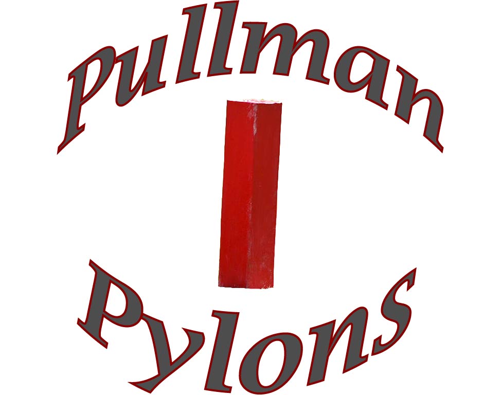
For my logo draft, I created a logo for my intramural sports team. For inspiration, I searched for other intramural team logos on google and I also looked at designs people made for video games. NBA 2k and MLB The Show allow you to make custom logos to use in their games, and I saw some cool designs on those games that inspired the logo that I came up with. I knew that I wanted to name the team the pylons just because I think the name would be funny, so I had to find a picture of a pylon that I liked. Finding the picture was pretty tough, especially one that could be licensed for free, but eventually I was able to find one and I put it in photoshop and made a cutout of it using the magnetic lasso tool. I used the eraser tool to clean up the bottom of the pylon and make it look a little nicer. After that I saved it as a .tiff. From there I put the cutout into illustrator and I put the text around the pylon. I made the font for the bottom text around 200 points and the top text around 180 points. I made the text fill something close to anthracite and the border crimson. I figured since it is a logo for an intramural sports team, Cougar colors would look good as part of the logo. I made the border for the text 4 points to bring out the crimson a little bit more. I also warped the text so that it would wrap around the cutout of the pylon. I also made sure to choose a font that I liked , something that would stand out. I also made the font demi-bold italic, and I liked the way that it made the font look, so I kept it.
Logo Sketch
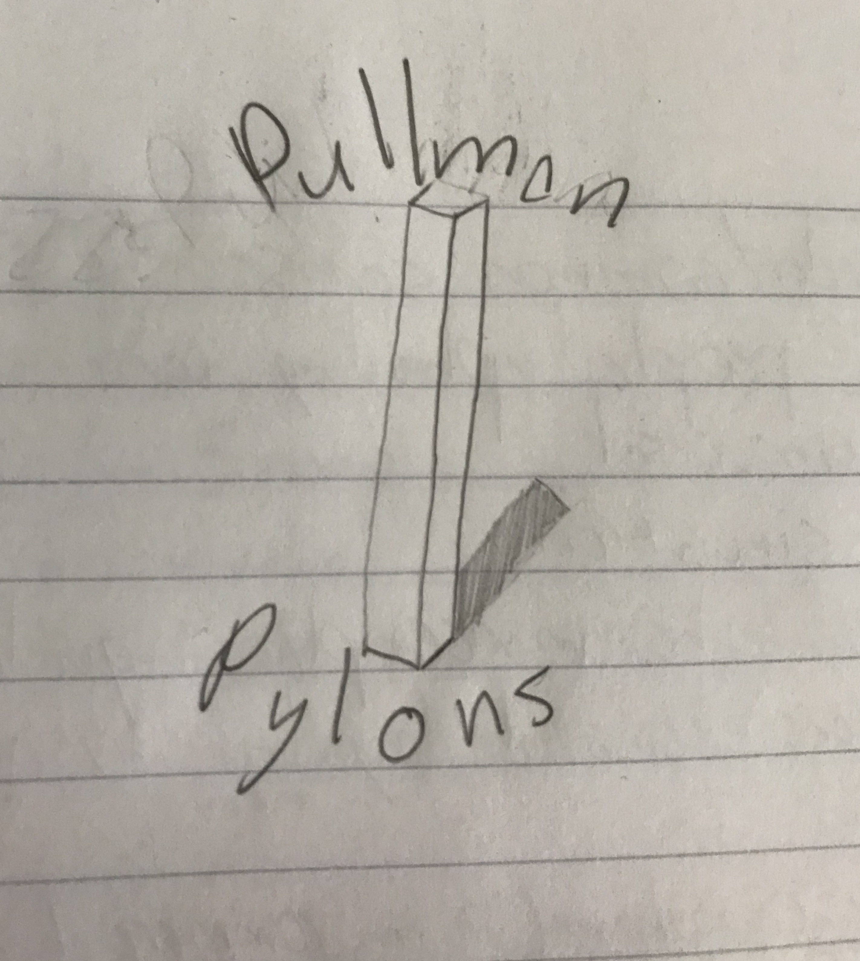
This is my sketch for an intramural team logo.
Final Graphic Design Project
For my draft, I decided to create a brochure cover for my graphic design project. My topic is intramural sports so I created a brochure cover that would advertise for WSU intramural sports. I tried to use the laws of proximity and continuation in my design. Continuation was one I really tried to incorporate because with the theme of intramural sports having the impression of motion in my design was important. I tried to incorporate as many sports as possible in my design to showcase the variety of intramural sports offered at WSU. I used the grass from a baseball field as a background, and a cutout of a baseball player to make sure baseball and softball were represented in the graphic. I also used cutouts of someone playing a golf and someone playing basketball to illustrate some of the other popular sports offered by the school. I framed the title of the graphic with hockey sticks to show yet another intramural sport that is offered. I got the images that I used from Pixabay, the website made it easy to find cutouts from a variety of sports that I could use to create an effective brochure cover. The basketball cutout required me to use the magnetic lasso tool and create multiple layers to get the person, the ball, and the hoop, but I was able to do so using multiple copies of the picture. Other than that, most of what I had to do was just placing and rotating the images I used to create the graphic. I also used the text tool to create the title and the information in the bottom right corner. I tried to pick an interesting font for the title and information. In the final draft, I decided to change the font because the font that I picked for the draft just wasn’t as appealing when I took a second look at it. I also thought it was a good idea to make crimson the font color, and gray the outline color, given that it is being used to advertise for WSU intramural sports. For the final draft, I received a lot of feedback on my design. I tried to incorporate as much of the feedback as possible into my final draft. I decided to resize my design so that it better resembled a brochure cover. I also added a border and put a grey outline on the text. From there, I resized the images and placed them in spots that better fit the new shape of my graphic. I think adding the border gives the graphic some depth and makes it look more professional as a whole. I think the feedback I got gave me some great ideas for the final design and I believe my final draft is miles ahead of my original draft that I submitted.

All pictures used under a Pixabay license:
https://pixabay.com/vectors/golf-accuracy-balance-control-club-3494533/
https://pixabay.com/vectors/baseball-baseball-bat-hit-black-150324/
https://pixabay.com/photos/basketball-sport-ball-game-2258651/
https://pixabay.com/vectors/hockey-stick-hockey-ice-sport-147984/
https://pixabay.com/photos/baseball-field-landscape-lawn-green-1548348/
